
Feedback from Anne Goodfriend, Su Ayun Kim and Uttam Gandhi
- User need is clear but hard to identify what the product could solve, maybe explaining it through a user journey would be very helpful.
- How can ML provide recommendation than my trained eyes, can ML give me a detailed reason for why some recommendations are given. Like stroke weight, pixel size, etc
- I think you downplayed the significance of what you are making
- Be clear on what’s presented on each slide
- It’d help to use smaller language

Quick & Dirty Show
Although the overall wireframe and prototype were still undone, I decided to make simple prototype that people can interact with and conducted user testing. The general style other than its functionality followed the original Noun Project site, thus I'm only including its wireframe and handwritten sketches that focuses on navigation. Its style will be eventually altered throughout the process. Here are some feedbacks I got:
- The transition between "Icon Select" and "Start a Set" was unclear to users--needs clear visual queue
- suggestion: Look into Google's Search by Image thumbnail
- Maybe needs some info/description about "Start a Set"?
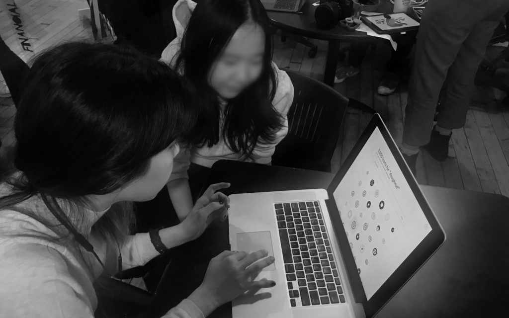
- The t-SNE map is interesting and helps to understand the system
Next
- Audiences were overall confused about how it functions, and why it can be useful. It will be helpful to add solid description on landing page, or through question mark button.
- Give actual example of "set/related recommendation" on grid, overlap them...etc
- show t-SNE map
- Make the transition between "Icon Select" and "Start a Set" clear
- Google Search by Image
- or other Reverse Image Search examples
- Finish the Search by Collections side

No Comments.